Logo for a team at Google
Redefining the visual identity for Crosstie, a team within Site Reliability Engineering (SRE).
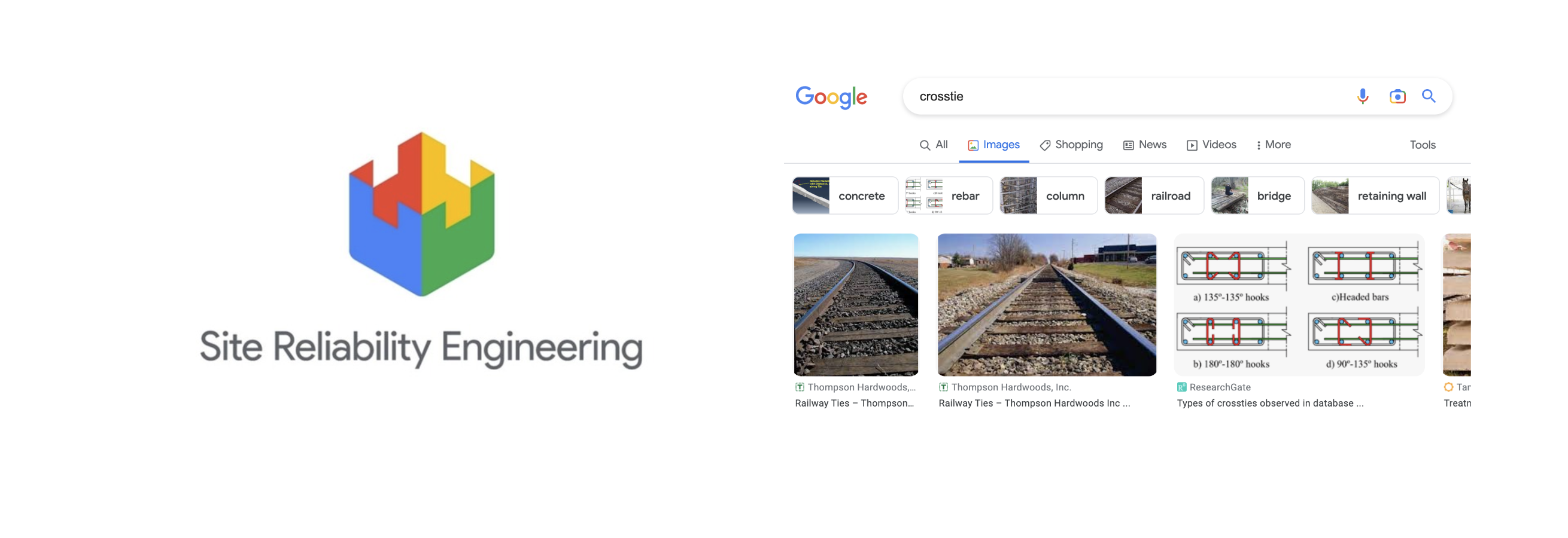
Crosstie: the team and its meaning
Crosstie, sometimes stylized as X-tie, stands for Cross-TI Execution (TI meaning Technical Infrastructure). The name “Crosstie” also refers to the wooden piece that connects the two rails of a railway track, symbolizing connection and support. Before the redesign, the team used a grayscale, old-fashioned drawing of a railway track section as their logo, which no longer reflected their dynamic and forward-thinking mission.
References and Concept Development
To create the new logo, I drew inspiration from two key sources:
-
The overarching SRE organization’s logo to ensure alignment with Google’s visual identity.
-
The imagery and symbolism of crossties, which not only inspired the team’s name but also represented their purpose of connecting and enabling cross-functional execution.
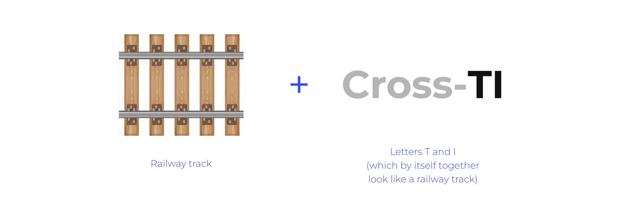
During the design process, I discovered that the letters “T” and “I” could be visually tied together using the concept of a railway track. This idea became the foundation of the new logo.
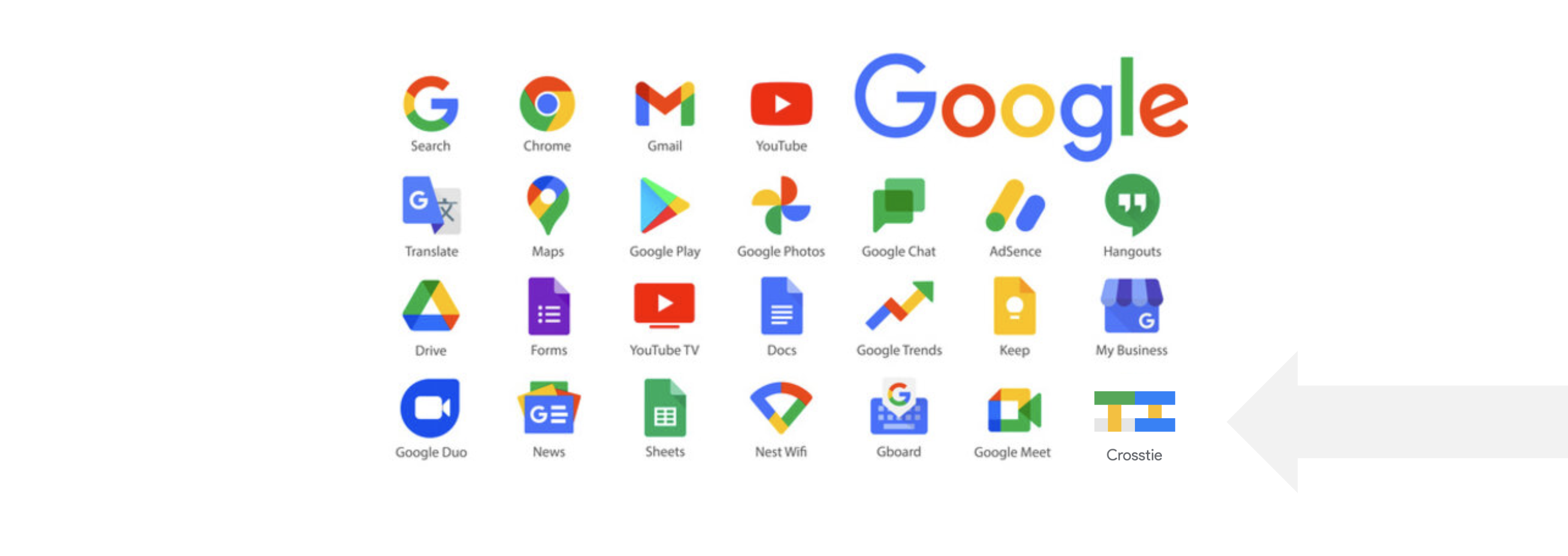
The final logo
The redesigned logo symbolizes a crosstie and reflects the team’s mission on multiple levels while adhering to Google’s visual identity guidelines. It represents connection, execution, and alignment with the broader SRE organization.

Impact
This work was submitted for an internal logo competition at Google and won. The Crosstie team now uses this logo internally, giving them a modern visual identity that better represents their purpose and aligns with Google’s design standards.
© Anna Lukyanchenko 2025 — all rights reserved