Seafishtrade
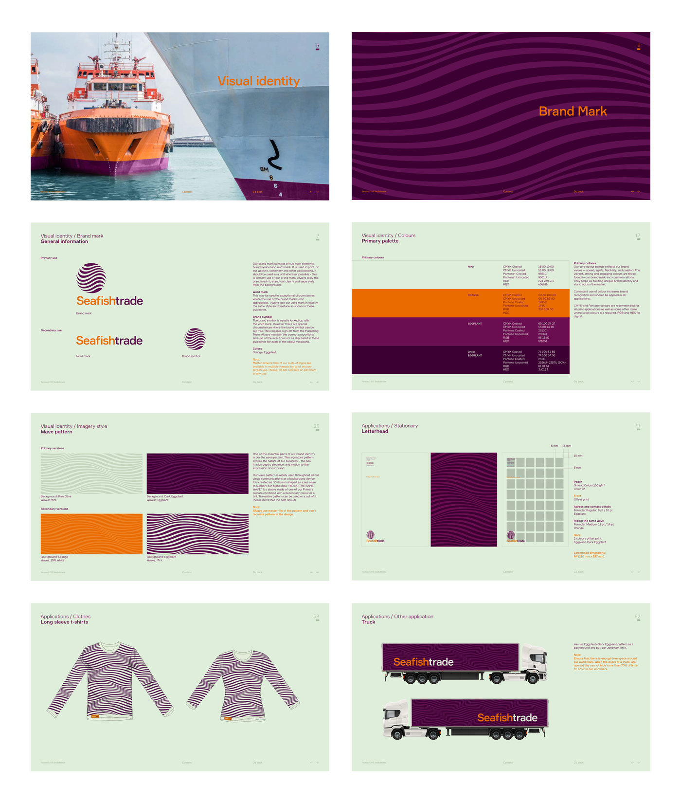
Visual identity for a fish trading company
Background
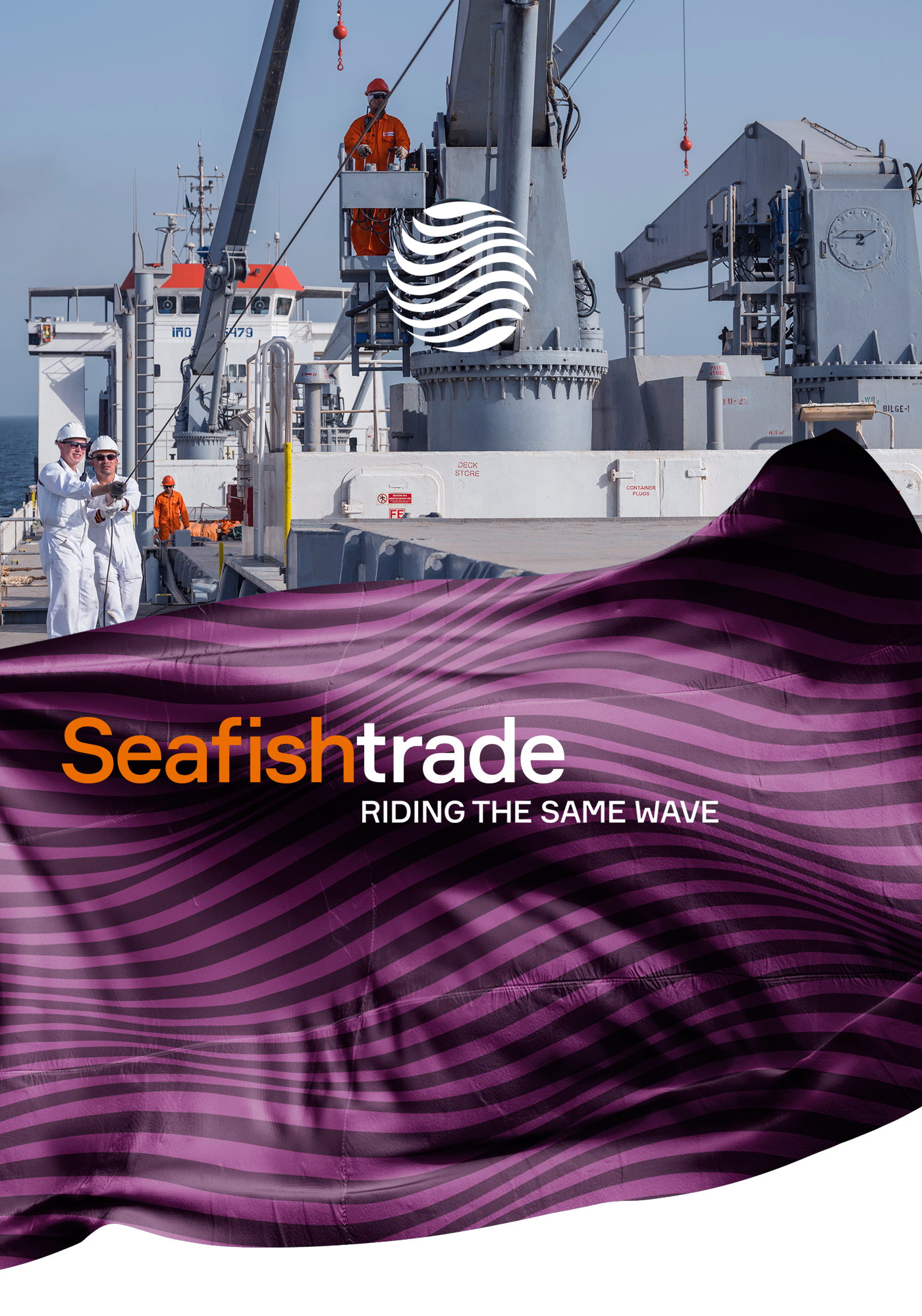
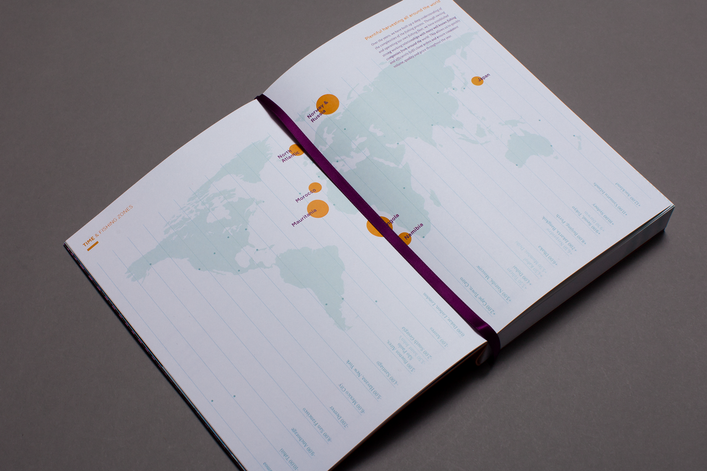
Seafishtrade is a successful European trader of frozen at sea fish products operating in West Africa, Europe and China. Their identity underserved the true advantages and values of the company, making them look obsolete and traditional, like the rest of the industry.
Idea
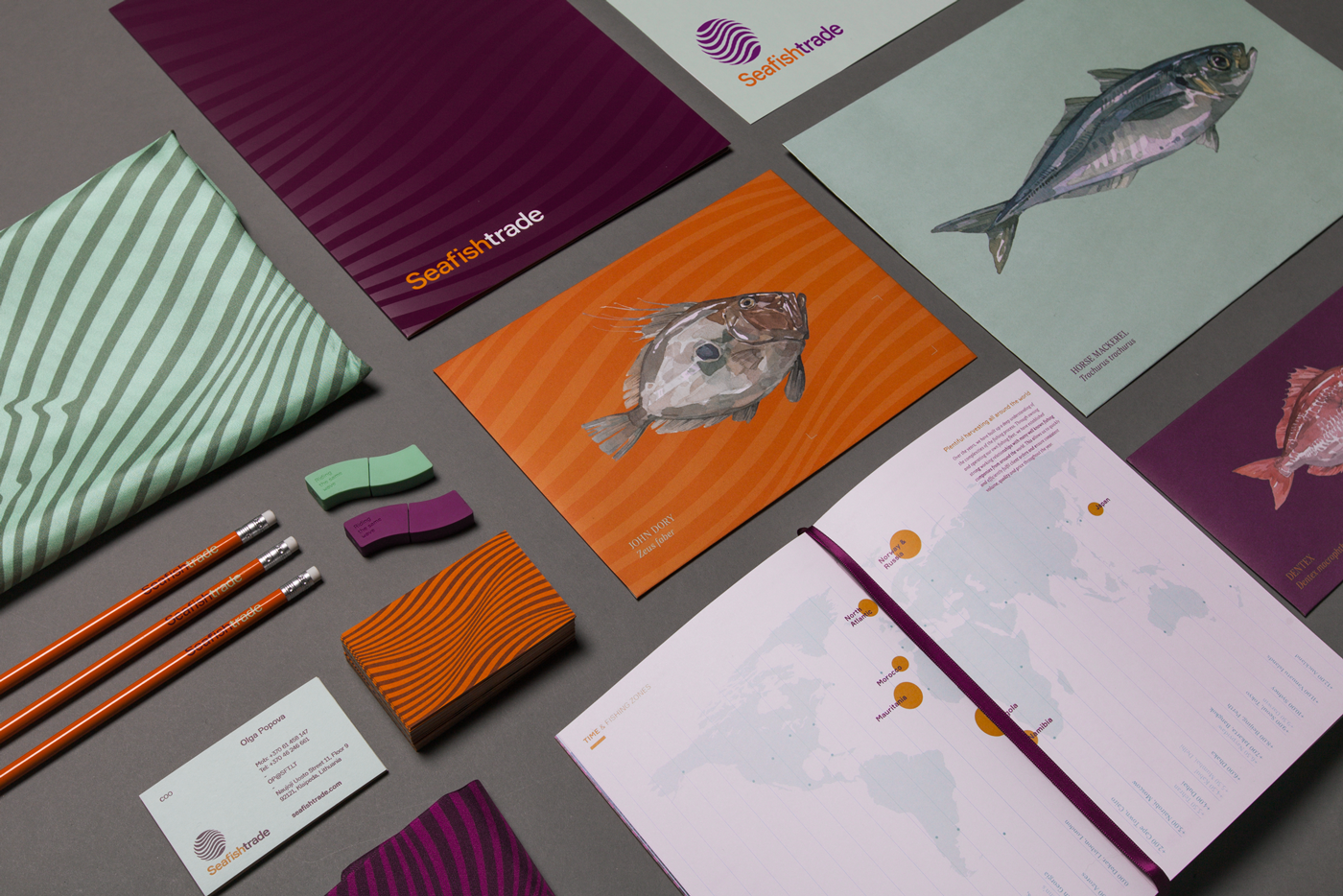
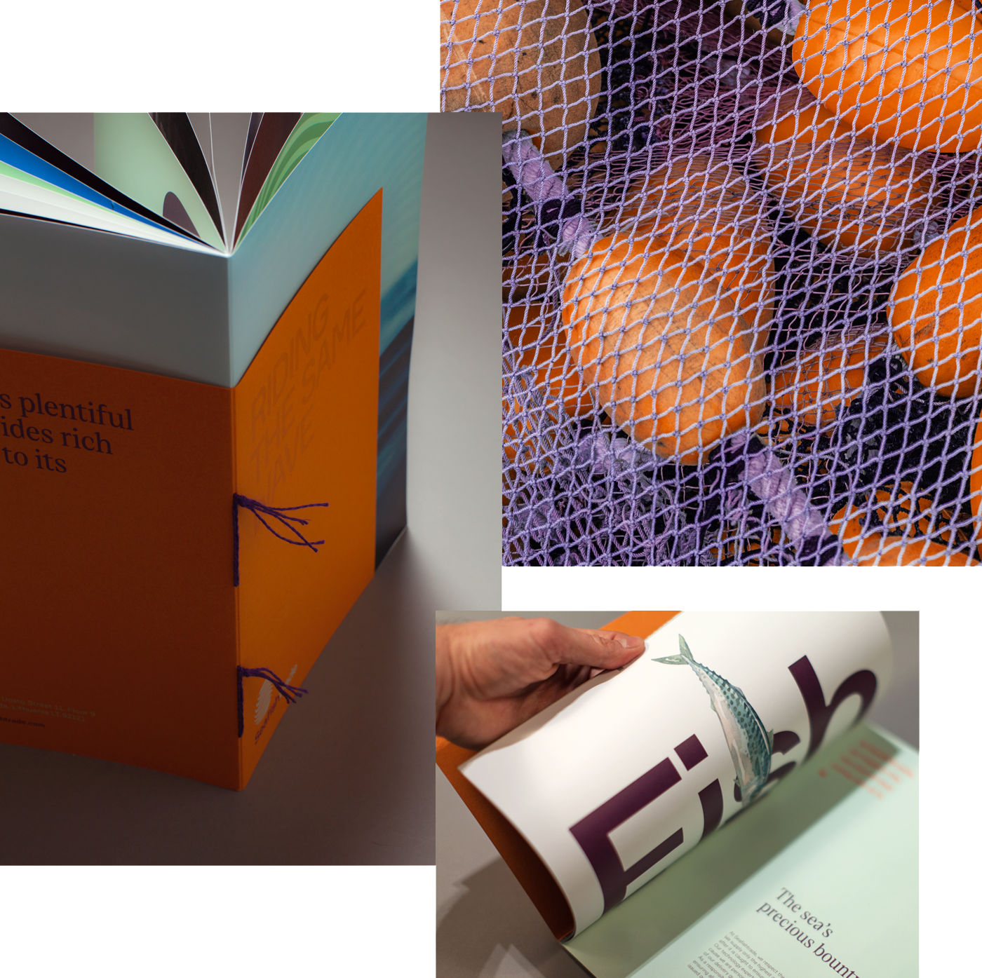
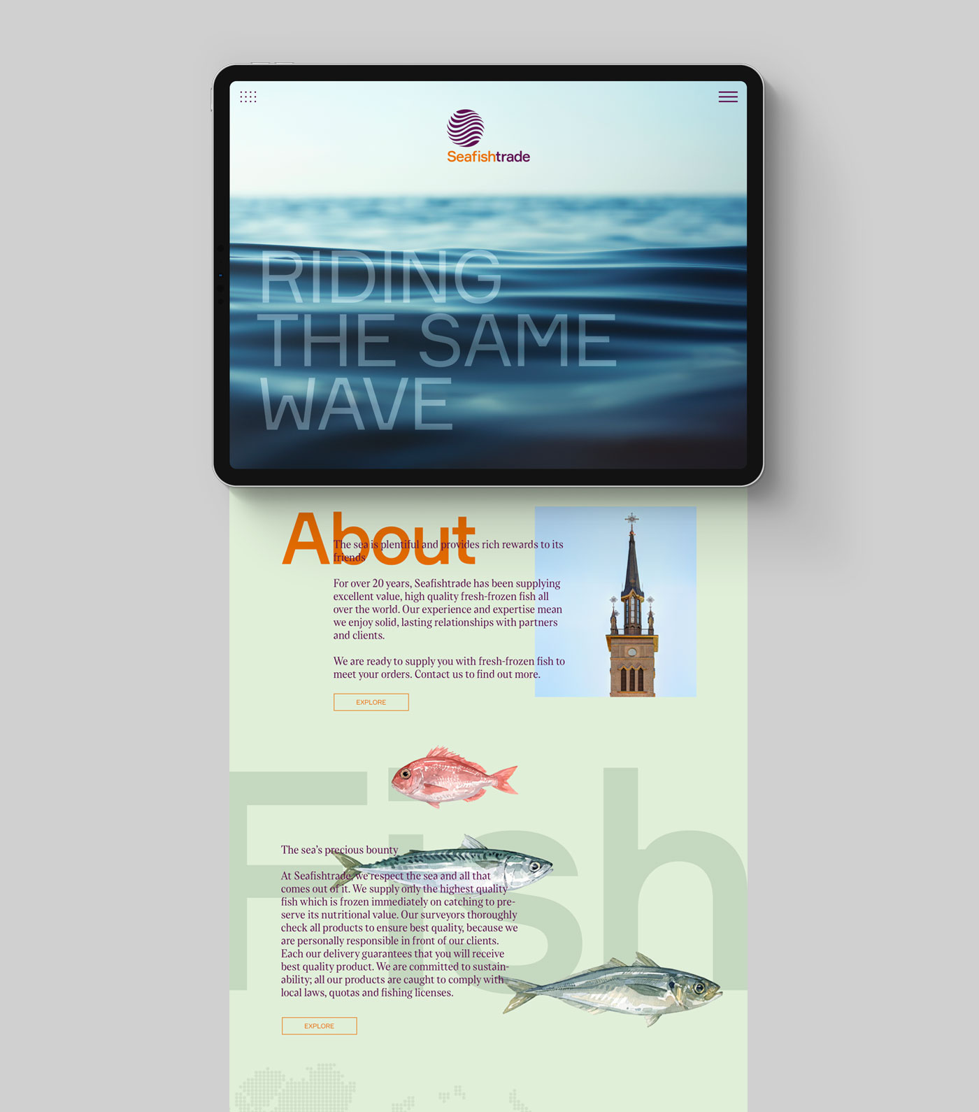
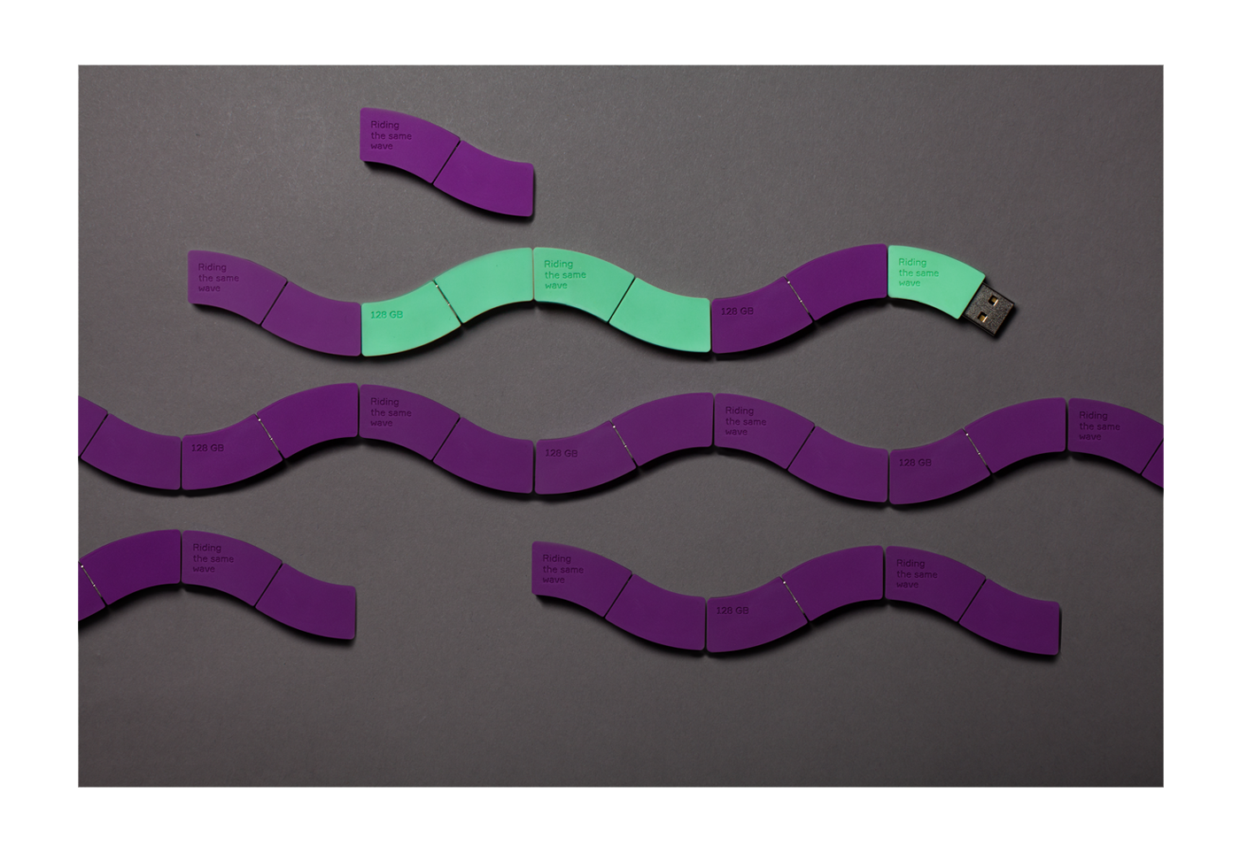
Redefine the company’s core message to effectively communicate their purpose and create a bold visual language that bounds thes. fishing community. As the sea, the graphical approach never stands still reflecting the young and dynamic spirit of the company while building on their core busines
![]()

Result
The client reported that since the launch of the new identity in January 2018, they have received only positive messages from partners, banks, and buyers stating that they, too, are on the same wave with them.
To date, trade has increased volume by 15-20% compared to last year. The new identity is plays a big role and is emphasizing the company’s professionalism and building more confidence to do business with them.





 Credits
Emma Beckmann — President, CEEMEA region
Oleg Kuzmin — General director, Landor Moscow
Igor Blagodarskiy — Senior Strategist
Maksim Arbuzov — Design Director
Marina Nemchina — Client Director
Darya Ksenofontova — Senior Designer
Anna Lukyanchenko — Graphic Designer
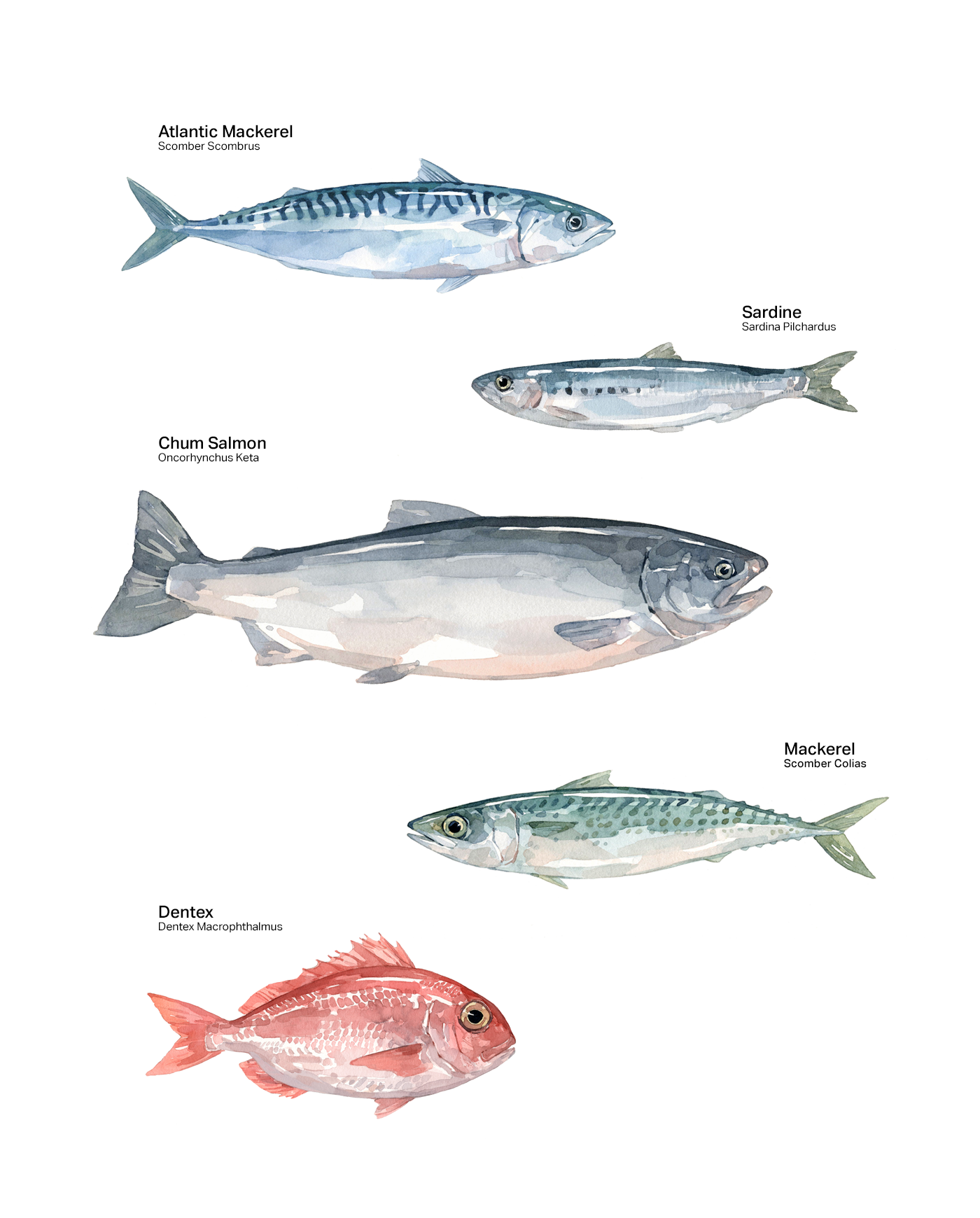
David Scheirer — Illustrator
Frank Herfort — Photographer
Mikhail Dmitrienko — Copywriter
Anna Dewis — Copywriter
© Anna Lukyanchenko 2024 — all rights reserved